

Do you ever struggle with which colors to pick when coloring your mandalas? Do you find yourself reaching for the same colors? In this week’s post I share with you an introduction to color design theory.

I personally think it is really cool to see how the colors are mapped out on a color wheel and to see the relationships of colors. In this post, I use the same mandala design throughout to give an easy side-by-side comparison. For your own color study, I recommend drawing a mandala and then scanning and printing copies of it (or hit a photocopy machine). It is fun to see the same design colored in different ways.

Primary Colors
Any study of color begins with the primary colors: red, blue, and yellow. What makes them primary? Well, you can’t create them. No mixing of other colors will produce these three. From these three colors all of the other colors are made. Cool, isn’t it?
The mandala pictured above is colored with the pure hues of red, blue, and yellow. It’s pretty intense, don’t you think? It reminds me of the logos for fast food chains and in other products like the one’s pictured below.

The color scheme is designed to be bold and eye catching. Good qualities for some product images, but it’s not necessarily the feeling that we want from our mandalas.
Don’t write off the primaries just yet.

Using Tints
Here we see how tinting the colors can “tone it down.” When painting, to tint a color use white paint and use gray paint to tone the color. If you are using markers or colored pencils, you may reach for a lighter version of the colors.
Compare and contrast each of these mandalas. The top example uses the pure hue for each of the three colors. In the example in the bottom left mandala, notice how using a light yellow softens the overall feeling. What a difference!
Let’s play with tinting some more. The mandala on the bottom right uses a light yellow and includes a tint of blue along side the pure blue hue. Here we see how many more coloring options we have with just three colors when we add “tints” of the colors.

Secondary Colors
The secondary colors, orange, violet, and green are made by mixing two primary colors.
Orange = Yellow + Red
Violet = Red + Blue
Green = Yellow + Blue

Using Shades
Just as we saw with the primary colors, the secondary colors can be bold and striking when using the pure hue. With the primary color example, we used a tint of some of the colors. Here I used shades (darker version) of violet and green. In painting, shading is achieved by mixing black with the color.
By darkening the violet, notice how the orange looks brighter. Don’t see it? Sit back from the computer and squint your eyes as you look at these two mandalas. Try it!

Inspiration Found in Nature
Nature is an incredible artist. Here is a photo that I took of orange pansies and violets. It’s a perfect example of a secondary color scheme. I sampled the colors from the photo and applied them to the mandala. {{swoon}}

Here we can see a few variations using the same palette of secondary colors. Notice how you can change the look and feel of the mandala depending on which color dominates.

Tertiary Colors
There are six tertiary colors derived from mixing a primary and a secondary color. Notice how the primary and secondary are next to each other on the color wheel to create the tertiary color.
Red-Orange
Red-Violet
Blue-Violet
Blue-Green
Yellow-Green
Yellow-Orange
In the mandalas above you can see how I mixed and matched the various tertiary colors. There is so much fun to be had with these tertiary colors.

Ready to take your mandala practice to the next level?
If you enjoy coloring mandalas, just imagine how deeply fulfilling it is to create your own. The joy multiplies when you design a mandala from your heart and then bring it to life with color. A wonderful next step is to explore chakra-inspired mandalas—each energy center offers a beautiful color palette and deeper meaning to guide your creative journey.
Here are a few resources to support and inspire your practice:

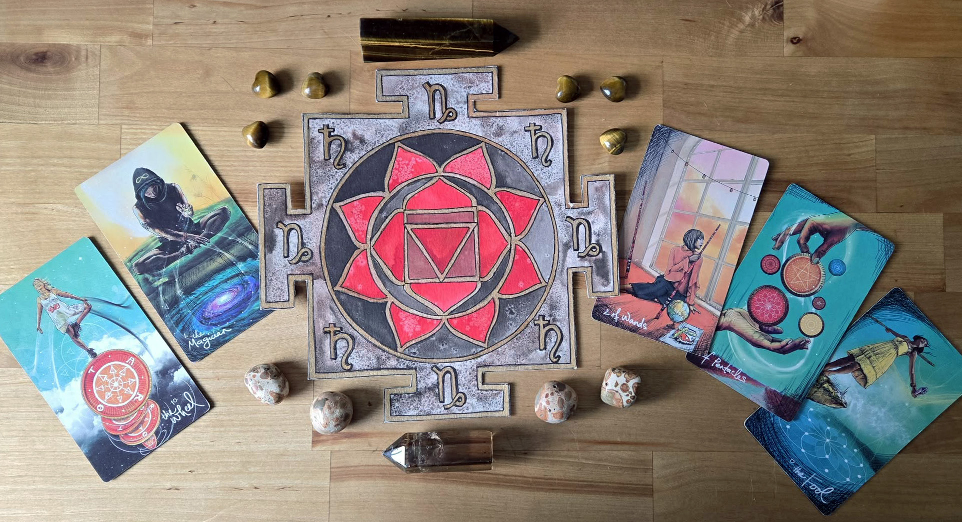
Chakra Stencils
No drawing skills are needed! Simply place, trace, and color. Each chakra reflects a different energy center and supports healing and awareness in your mind, body, and soul. A beautiful way to connect with color energy in a meaningful, personal way.

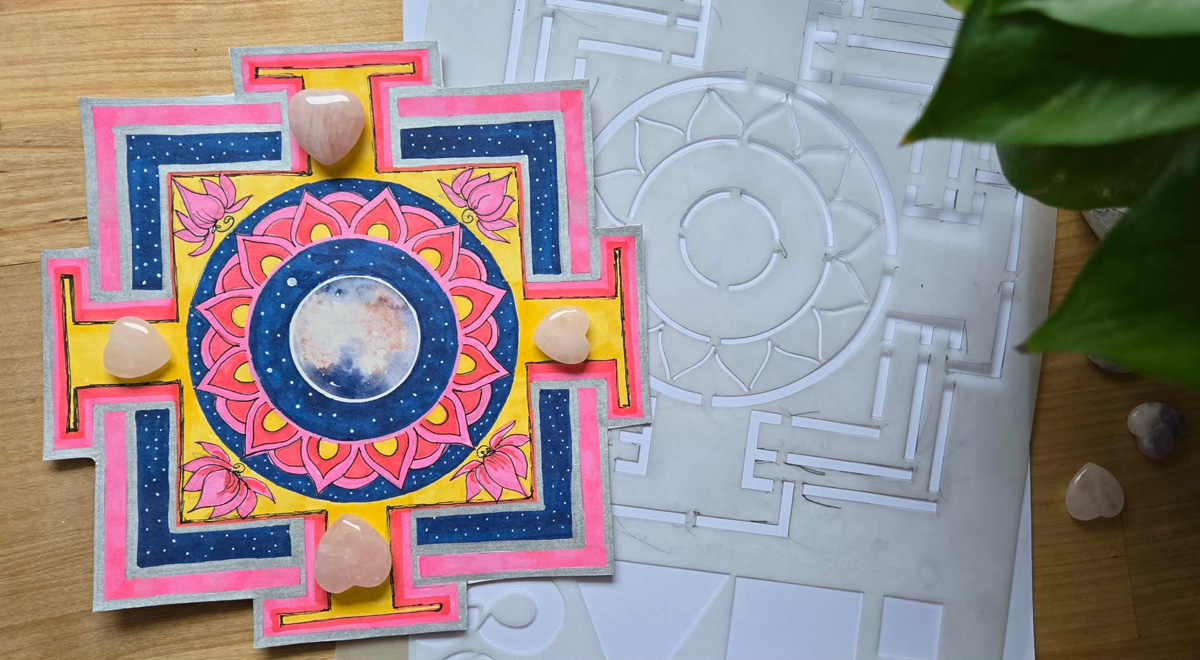
Four Gates Mandala Stencil
This stencil opens the door to a wide range of creative possibilities—and it’s just as easy to use. Explore the Journey of the Four Gates, a meditative mandala practice inspired by the four elements: air (thoughts), water (emotions), fire (desires), and earth (body). It’s a mindful way to take the zen of coloring even deeper.
Explore the Four Gates Mandala Stencil »
Discover the Journey of the Four Gates »

The Mandala Guidebook
Thousands have discovered the joy of creating their own mandalas—and it’s easier than you think! Learn the basics with clear, step-by-step instructions and inspiring examples. When you subscribe to the True North Arts newsletter, you’ll receive the first two chapters as a free download—my gift to you!
Learn more about The Mandala Guidebook »
Subscribe to get the first two chapters »
**Let your creativity blossom—**and let each mandala become a reflection of your inner wisdom and vibrant energy.


Leave a Reply